The AIGA (American Institute for Graphic Arts) has just published this overview of what it calls the “quietly beautiful” work of artist and designer Emil Antonucci.
Emil Antonucci redesigned Commonweal in the latter part of 1964, during the months when the journal marked its fortieth anniversary. The new design appeared at the beginning of 1965. I was a lowly editorial assistant but, as the son of artists, an intensely interested participant in the discussions around Emil’s ideas.
Had the magazine previously been consciously designed? Or had it merely evolved piecemeal? The dull gray look was reinforced by the cheap paper stock on which Commonweal was then printed. Headlines were merely larger versions of the text type; the only variation was between Roman and italic, and the only bits of life were the small black-and-white drawings, some of them excellent, that all too rarely broke up the columns.
Emil believed that the magazine needed contrast and distinctiveness. He provided it in three ways: the use of a bold, black Poster Bodoni font for heads matched with light italic subheads; a “signature” line of black bullets to mark off sections of the magazine and accompany the heads; and a re-rendering of many of the existing line drawings in strong silhouette or white-on-black scratchboard art. These drawings, along with the old ones, were catalogued under the range of topics that Commonweal often addressed and pulled out as needed. The magazine was still a weekly, and with its tiny staff in a pre-computer day, there was no time for outside artistic consultation on individual issues.
Emil’s redesign had another historic impact.
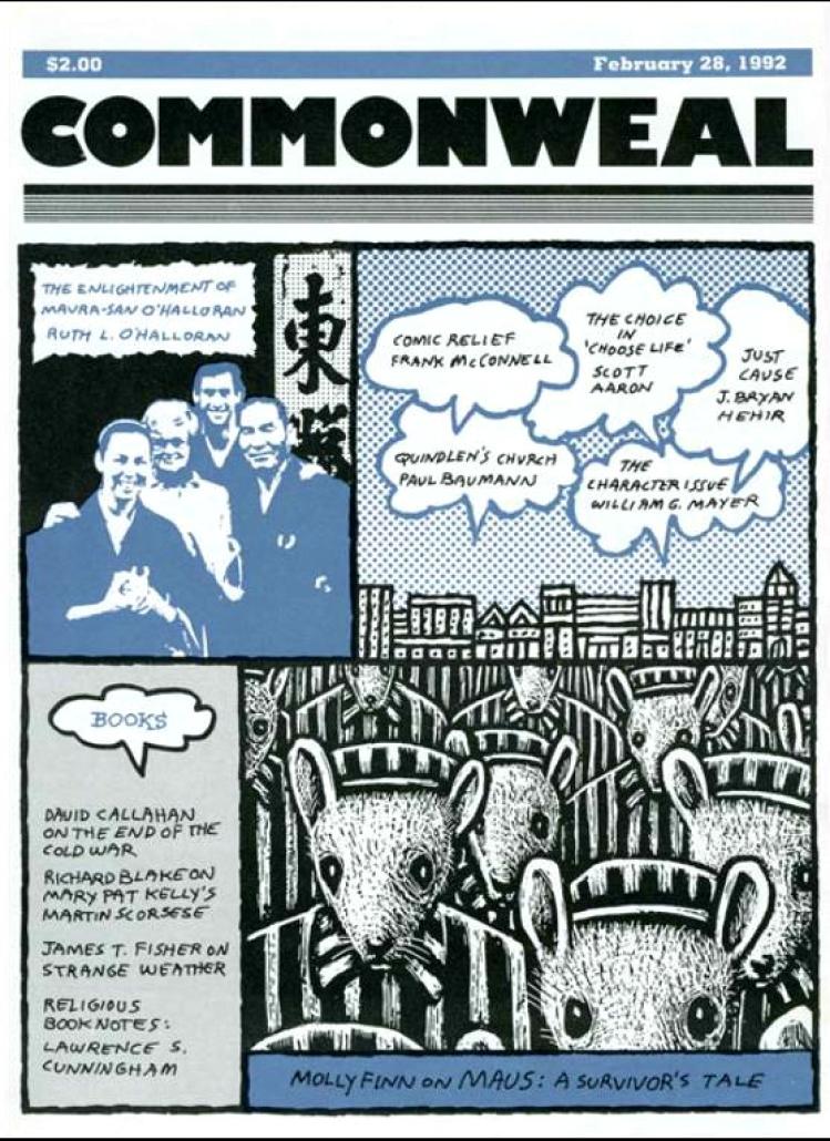
It changed the name of the journal from “The Commonweal” to simply “Commonweal,” appearing on the cover in a tight black block of lower-case Helvetic compressed type.
Emil had to compromise. As noted below, he had an affinity for the work of Eric Gill, the path-breaking English Catholic sculpture, engraver, artist, and typographer (and also, alas, more recently revealed as abusive parent and pedophile), whose writings had sometimes appeared in Commonweal . The Gill Sans Ultra font Emil would have preferred for heads was not available at the printer. He failed to sell the editors on Gill’s ideas about columns that were “ragged right” rather than justified and even. Some readers complained that the rows of bullets, however distinctive, were dizzying or distracting on the page.
Over time Emil’s design was modified. The covers came to feature more articles. The inside pages used a greater variety of illustrations and cartoons. Some of the bullets gave way to rules. The Poster Bodoni gave way to a different font for heads, available in more sizes and weights from a new printer. In October 1978, newly returned to the staff, I oversaw a significant change in the design—but one guided by Emil’s ideas about contrast and distinctiveness
Emil himself gave Commonweal yet another look at the beginning of 1987. This time he was able to use his favored Gill Sans Ultra for a new front-cover logo, for dramatic over-size initials to break up text, and for regular rubrics like “Screen” and “Books.” He replaced the surviving bullets with a distinctive new ruleand proposed running gray and colored screens behind illustrations.
Eschewing the “hifalutin claims” that had accompanied previous redesigns, the editors declared that “the new look arises purely from a spirit of playfulness, an impulse to try something else, a desire to work within a different esthetic framework. We’ve changed our design for the same reason that people… keep seeking new shapes for skyscrapers… periodically shift their furniture or alter the frames of their eyeglasses.” All the same, “the design was created by Emil Antonucci only after much consultation with the editors about Commonweal’s resources, schedule, special production needs, and the distinctive ‘feel’ of each section of the magazine.”
At that time, better quality paper stock, the use of four-color printing, in-house typesetting, and regular outside cover designs, all aspects of today’s Commonweal, remained far in the future. Given the existing constraints, Emil’s 1987 design was, in my opinion, one of the best in the magazine’s history.